Summary
Custom-built dialogs are common in web-based applications, but many are not accessible. Most of them are not announced to assistive technologies, and so screen reader users are not made aware that a dialog has been launched. Many are also not focused when they are launched, and so keyboard-only users are still focused on elements in the background, and might have to navigate through the content in order to reach the dialog.
The WAI-ARIA specification defines roles and attributes that help ensure dialogs are announced correctly to assistive technology users, and provides guidance on ensuring they are keyboard accessible.
Author: Gez Lemon
WAI-ARIA Dialogs
WAI-ARIA provides the dialog and alertdialog roles to define dialogs. The dialog role is used when the user is expected to provide data, and the alertdialog role is used to announce the contents of a dialog to the user.
The container element for both dialog and alertdialog should use aria-labelledby to identify the element containing the accessible name for the dialog (usually, the heading). This is announced when the dialog first receives focus, along with the role of dialog so the user understands the context. The aria-label attribute may be used if there is no heading in the dialog, but all dialogs should contain a visible heading.
Using the alertdialog role
Authors should use the aria-describedby attribute to identify the message of an alertdialog. When the dialog is displayed, focus should be placed on an active element within the dialog, such as an OK button.
Consider a simple dialog with a list of instructions for shutting down a system.
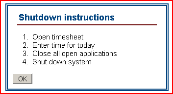
The container for the dialog should have a role of alertdialog, with the aria-labelledby attribute containing a value that matches the id attribute value for the heading, and the aria-describedby attribute containing a value that matches the id attribute value for the description.
alertdialog<div role="alertdialog"
aria-labelledby="dlgtitle"
aria-describedby="instructions">
<h1 id="dlgtitle">Shutdown instructions</h1>
<ol id="instructions">
<li>Open timesheet</li>
<li>Enter time for today</li>
<li>Close all open applications</li>
<li>Shut down system</li>
</ol>
<div>
<input type="button" value="OK">
</div>
</div>Using the dialog role
When a role of dialog is used, some screen readers will automatically go in to application mode. This shouldn't be a problem, as the dialog role should be used for getting data from the user, and screen readers usually automatically go into forms mode when interacting with form controls. Consider a dialog for the user to signup to a newsletter. As with the alertdialog example, focus should be placed on an active element within the dialog; in this case, the "Email" edit box.
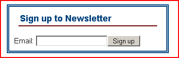
The container for the dialog should have a role of dialog, with the aria-labelledby attribute containing a value that matches the id attribute value for the heading.
dialog<div role="dialog" aria-labelledby="dlgtitle">
<h1 id="dlgtitle">Sign up to Newsletter</h1>
<div>
<label for="email">Email: </label>
<input type="text" id="email" name="email">
<input type="button" value="Sign up">
</div>
</div>If we add instructions to the newsletter signup dialog, a screen reader user wouldn't be able to use their reading keys to read the instructions, as the dialog is displayed in application mode. For this reason, instructions and cues should be programmatically associated using the aria-describedby attribute.
The following example includes instructions, which are programmatically associated to the "Email" edit box using aria-describedby.
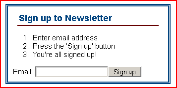
The email address now requires the aria-describedby attribute containing a value that matches the id attribute value for the description.
dialog with instructions<div role="dialog" aria-labelledby="dlgtitle">
<h1 id="dlgtitle">Sign up to Newsletter</h1>
<ol id="instructions">
<li>Enter email address</li>
<li>Press the 'Sign up' button</li>
<li>You're all signed up!</li>
</ol>
<div>
<label for="email">Email: </label>
<input type="text"
id="email"
name="email"
aria-describedby="instructions">
<input type="button" value="Sign up">
</div>
</div>
There shouldn't really be a scenario where a screen reader user would need to interact with content in a dialog using reading keys, but if there is, the content that requires reading keys should be placed in a container with a role of document. For example, if the dialog contains a data table, then the data table should be in a container with a role of document so that screen reader users can use their table reading keys to interact with the table.
Modal and non-modal dialogs
A modal dialog is a dialog that retains focus until the dialog is closed or dismissed. It should not be possible for keyboard-only users to accidentally tab into the background content when either a modal or non-modal dialog is displayed. With a modal and non-modal dialog, the user should either explicitly dismiss the dialog (for example, selecting "Cancel" or pressing ESC) or close it by taking a positive action, such as selecting "OK" or "Submit". With a non-modal dialog, the user should also be able to use the F6 key to switch between the dialog and the main content.
Further reading
- WAI-ARIA Authoring practice design pattern for a modal dialog
- WAI-ARIA Authoring practice design pattern for a non-modal dialog
- Hans Hillen's dialog widget example
Category: Accessibility.
[custom-built_dialogs.php#comment1]
Gez is there a recommendation for switching focus between a modeless dialog and it's parent with touch only access? It might seem like an edge case but I often use full sites on a tablet.
The problem I see is selecting the larger parent would naturally bring it to the top of the Z order and so obscure the modeless diaglog, making it impossible to get back given the current state of the art of UIs
Posted by Steve Lee on
[custom-built_dialogs.php#comment2]
Hi Gez, this is brilliant, thanks!
I'm also pleased you bring up what I believe to possibly be one of the most frustrating issues surrounding modal dialogs, in addition to conveying their presence to assistive technologies - the problem of tabbing outside the dialog and back into the main content.
This is particularly problematic when the dialog is displayed using a lightbox effect (when the main content behind the dialog is "greyed/blacked out"), as (assuming the browser's own focus indicator is being used) it's almost impossible to identify visual focus...so, the user has to keep tabbing backwards or forwards until they arrive back inside the dialog. Hans' dialog widget is a great example of how it should be done!
Graeme
Posted by Graeme Coleman on
[custom-built_dialogs.php#comment3]
Doh - to answer my own question - selecting between parent and modeless does NOT change Z order in any UI - it simply switches KB focus and possibly dims the dialog. That works just as well in touch-only interactions, though you touch again in a control to actually get focus and the OSK. Sorry for the noise.
Posted by Steve Lee on
[custom-built_dialogs.php#comment4]
Just a quick remark. I don't see anything on the ARIA spec about having a mandatory heading inside the alertdialog you can use the id attribute of the paragraph containing the alert message in the aria-describedby attribute
Posted by goetsu on
[custom-built_dialogs.php#comment5]
Thanks for the great series of blog posts lately on the more advanced topics in accessibility!
Do you have any links to good examples that follow your instructions? I'd love to play with some live.
Do you recommend sending focus to the first active element in the dialog (the OK button) because the other text information above the OK button should be announced automatically by screen readers after they activate the dialog? Will all screen readers automatically speak the aria-labelledby and -describedby text when the modal receives focus even if you send it to a button?
Is it wrong to recommend sending focus to the dialog's heading text instead of the first active element to make sure the heading text is spoken?
I have see other recommendations to avoid using the dialog role because that puts the SR into application mode and they can't use their arrow keys to read the text content inside the dialog. I read that you're recommending to put any text content that needs to be navigated in a document role so they can use their arrow/reading keys.
Is NVDA the only screen reader that would allow you to easily exit application mode inside a dialog to read the text by pressing the ESC key?
Would it be wrong to wrap the dialog in a div with role=dialog then wrap all text content in a div with role=document? Is that incorrect if used in all dialogs, even those without say a data table to navigate?
Sorry for all the questions. I appreciate any advice you can give.
Thanks!
Posted by Paul J. Adam on
[custom-built_dialogs.php#comment6]
Gez, This is a good article because it shows how the roles should be placed. Other posts like yours just talk about best practises (ex Roger's http://www.456bereastreet.com/archive/201104/keyboard_accessibility_again/). One thing these don't show is how to do the things you mentioned, such as trapping focus in the dialog until closed. Have you thought about doing a post showingg that?
Posted by Ryan Benson on
[custom-built_dialogs.php#comment7]
Thank you everyone for the kind words, and great comments.
@goetsu
WAI-ARIA doesn't dictate that alertdialog should have a heading, but my personal opinion is that all dialogs should have a heading. A dialog is defined as a small application window, and all windows should have a title. The equivalent of a title in a custom-made dialog would be to have descriptive but succinct heading that's programmatically exposed through the aria-labelledby element.
Posted by Gez on
[custom-built_dialogs.php#comment8]
Hi Paul,
Thank you, they're great questions. My responses below:
Apart from Hans' example in the further reading section, I don't have any particularly good examples to share. But it's fairly simple to set up a simple dialog and test.
Yes, but the first active interface element might not be the OK button in the case of a dialog. The other text is not automatically guaranteed to be announced. In the case of an
alertdialog, the text to be spoken should be identified by thearia-describedbyattribute. With a regular dialog, the title of the dialog will be announced, followed by the element that receives focus.In theory, yes. Not all user agents support WAI-ARIA, but obviously that situation is expected to improve.
That is the old-school method of ensuring a dialog is announced by its accessible name. With WAI-ARIA, that technique is no longer required, but works okay with user agents that do not support WAI-ARIA.
A role of dialog is the correct role to use when you're collecting data from a user. In this situation, the user shouldn't need to use their reading keys, as the accessible information is available in forms mode. As I mention in the article, this can be augmented using the
aria-describedbyattribute to point to relevant instructions or cues.Yes, although I've never actually encountered that scenario, and would guess it's more an indication of poor design. But that technique does work.
I suppose it depends on context, but I can't imagine a scenario where that would be a good solution. If the content is completely read-only and a screen reader should use their reading keys, then
alertdialogwould be a more appropriate role, as reading keys work correctly withalertdialog. If the dialog is gathering data, then a screen reader would be in forms mode, so shouldn't need reading keys. If the content of a dialog was so complex that a label along witharia-describedbywasn't sufficient, I would guess that it's down to poor design.Posted by Gez on
[custom-built_dialogs.php#comment9]
Hi Ryan,
Trapping focus is simply a case of having a
keypressevent handler, and moving to the first active element in the dialog if TAB is pressed on the last active element in the dialog, and moving to the last active element in the dialog if SHIFT + TAB is pressed on the first active element in the dialog. The following is an outline of the function that would be triggered by akeypressevent:See Hans Hillen's dialog widget example to see this kind of arrangement in action.
Posted by Gez on
[custom-built_dialogs.php#comment10]
I disagree that a alertdialog need an specific heading everytime because most of the time the dialog appear just after an action so the user know the context and know what kind of response he will have.
For example, the content of the alertdialog can be something like "message send" or "message deleted" and in that case I don't see any value to add a heading
Furthermore, the level of the heading can be tricky if you don't want to break the heading order (except if you use h1 everytime and if the modal code is at the end of the source code)
Posted by goetsu on
[custom-built_dialogs.php#comment11]
@goetsu
If the message is as succinct as "Message sent", or "Message deleted", then the title should be equally succinct. "Sent", "Message sent" or "Deleted", "Message deleted". In my opinion, all windows should be titled (with custom-built dialogs, that should be with a heading and aria-labelledby). Providing an accessible name for the dialog doesn't result in confusion at any point, whereas neglecting to provide an accessible name could; hence, all windows should have an accessible name.
The dialog is a new window, so the major heading for the dialog (used to title it) should start with h1. Its position shouldn't matter, as it's a new window to the main content. If it's modal, this is the only window that counts. If it's non-modal, then this is the major heading for the window that's not in the same context of the main content.
Posted by Gez on
[custom-built_dialogs.php#comment12]
Is it wrong to recommend sending focus to the dialog's heading text instead of the first active element to make sure the heading text is spoken?
I have see other recommendations to avoid using the dialog role because that puts the SR into application mode and they can't use their arrow keys to read the text content inside the dialog. I read that you're recommending to put any text content that needs to be navigated in a document role so they can use their arrow/reading keys.
Posted by Demon on
[custom-built_dialogs.php#comment13]
Hi Demon,
It is wrong to focus on the heading instead of the first active element, as the heading will be announced automatically as the accessible name if aria-labelled is used as described in this article.
Avoiding the dialog role is also inadvisable, as otherwise it will not be conveyed correctly to people using assistive technologies.
Posted by Gez Lemon on
[custom-built_dialogs.php#comment14]
Hi Gez,
A colleague and myself have been discussing dialogs lately. We've been involved with a lot of WCAG assessments as well as being tasked with creating some best practices for internal development.
We've assessed a number of wordpress & drupal sites which love to use dialog style/lightbox widgets as ways for users to provide feedback or show larger images as part of an image gallery or as alternatives to a pop-up containing 'our terms and conditions'. With some of these "dialogs" even having paging.
To my thinking these are not dialogs, however the concept of "dialog" seems appropriate to provide non-visual users with the context of what is happening on the page as well as the ability to communicate info by describedby/labelledby/etc.
A further concern with dialog is capturing keypresses, where while you don't want users to move out of the dialog without closing, they still need to be able to navigate the content particularly when the dialog does not contain form elements (apart from a close button).
We've discussed creating our own non-aria substitute for situations like these, providing equivalent role, name etc info via other mechanisms.
should we insist on the ARIA approach regardless and make all content accessible using the mechanisms it provides. What are your thought?
Thanks.
Posted by Leon Andersen on
[custom-built_dialogs.php#comment15]
Hi Leon,
There is a bit of a trend for having what should be complete pages as overlays marked up as dialogs at the moment. Apart from being a bad design pattern, if they're marked up correctly they shouldn't present problems.
I don't understand the issue with people being able to navigate the dialog when there's only a close button. This type of dialog should be an alertdialog; sighted keyboard-only users can scroll if necessary using the cursor keys, and screen reader users can navigate the dialog using their virtual navigation reading keys (the background content should be hidden with aria-hidden="true" so the screen reader only navigates to elements in the dialog).
Posted by Gez on