The standard method for hiding text visually to retain a clean design but provide context for screen reader users is to use the CSS clip technique. Due to browser bugs with the clip
property, other declarations are used to make this technique work correctly across different browsers.
Two of the properties used in the additional declarations for the clip technique are position
and overflow
. Unfortunately, due to a bug with Firefox, when these two properties are used together in a rule applied to the label element (regardless of property value), they cause the label text to not be exposed as the accessible name for the corresponding form control. The position
and overflow
properties are also used in other techniques for hiding text visually, but this bug means the accessible name will not be available for screen reader users when applied to a label element.
There are times when things make sense visually, but context would be useful for screen reader users. For example, "read more" links might make sense visually, but when tabbing through content with a screen reader, the user needs to investigate the surrounding content to get the context for each "read more" link; whereas, "read more about The Beatles" provides the context within the link phrase. To avoid disrupting a clean design, accessibility aware developers provide the context so that it's available for screen readers, but hidden visually. The following markup example provides the context for a "read more" link in a span
element.
The span
element in the above example can then be targeted with CSS so that it isn't visually displayed, but announced to screen reader users for context.
There have been several techniques used to hide content so that it is still available for screen reader users, but the clip technique is generally agreed to be the best solution as it satisfies the requirements of hiding the text while ensuring the text is still readable with a screen reader, and works with left-to-right and right-to-left languages. If browser support for CSS was implemented correctly across browsers, the following CSS rule would be all that's required to hide content visually.
Unfortunately, other CSS properties are needed to overcome rendering bugs in some browsers. For example, Safari, Chrome, and Opera sometimes introduce scrollbars depending on the size of the element and its position on the page. IE6 and IE7 do not support the correct syntax for the clip
property. The following is an example of the CSS rule with other declarations to ensure it works correctly across browsers.
When the CSS properties position
and overflow
are used together in a rule that is applied to the label
element with any valid property value, the label text isn't exposed as the accessible name for the corresponding form control in Firefox; even if the values are the default values for the property (position: static
and overflow: visible
). This means that when a screen reader user navigates to the corresponding form control for the label, they do not hear the accessible name that should be provided by the label; instead, they simply hear the role of the form control. For example, without an accessible name a screen reader might announce an edit box as, "Edit, type in text", rather than the label text to provide the purpose for the edit box. The label can be navigated to virtually in NVDA and JAWS, but the label isn't exposed as the accessible name for the form control as it should be.
My colleague, Hans Hillen, filed this is as bug with Firefox last year, but the bug hasn't been assigned to anyone yet. As the position
and overflow
properties are used together in several techniques for providing invisible context for accessibility purposes, it is important developers are aware of this bug and that it is fixed soon in Firefox.
We generally recommend the title
attribute or the aria-label attribute if there is no visible label at all (such as checkboxes arranged in grids that make sense visually). We only recommend using the CSS clip technique when the rule is applied to some of the label, rather than the entire label. Until this bug is addressed in Firefox, using the title
attribute or aria-label
attribute are the recommended techniques for providing a programmatic label for form controls that do not have a visible label.
If the label approach must be used and then visually hidden, apply the CSS rule to a span
element within the label
element, as the bug is only triggered when the rule is applied to the label
element.
Icon fonts are vector graphics that are included in the content using the CSS content
property on a before
or after
pseudo-class selector. As with regular fonts, icon fonts are scalable and can be styled using CSS, unlike images. They also have the benefit that they remain visible in high contrast on Windows, unlike CSS background images. The biggest drawback from an accessibility point of view is that they won't work if a user's user-defined style sheet overrides the font-family
property.
Icon fonts are generally good from an accessibility point of view if used correctly, as they are scalable and remain visible in high contrast on Windows. Using icon fonts that use the Private Use Area of Unicode, such as IcoMoon, work well with assistive technologies. If the icon is purely visual, then the aria-hidden attribute should be used on the element to ensure it is not revealed to assistive technologies.
If the icon is used to convey information, then it should contain a text alternative that may be hidden visually if required, but available for assistive technologies.
The text that provides the context for the icon can then be hidden visually with CSS so that it's still available to screen reader users.
To work, icon fonts depend on the font-family
property in CSS. If the icon is purely decorative, being overridden by the user's style sheet isn't an issue. When an icon font is used to convey information, such as the graphic for a button element, it means the visual representation will be missing, which is a serious issue.
There isn't much data available about how widely user-defined style sheets are used by people with disabilities. It's probably fair to say that the number is low due to lack of awareness, but the benefits can be great for people with vision impairments or reading difficulties. I asked my colleague (and occasional running buddy) David Sloan if he was aware of any research, and he pointed me to a study about understanding users' text requirements that analyses 203 user-defined style sheets from 25 people.
For readability, it seems reasonable to assume that the font-family
property is likely to be overridden. The study shows that font-family
is the fourth most common global property, and the second most common element-level property to be overridden in the user's style sheet. Although the number of people using user-defined style sheets for accessibility might be small, they shouldn't be overlooked.
font-family
is honoured
One solution to the problem is to use a script to determine if font-family
is honoured. If the property is honoured, then use icon fonts; otherwise, only use them if they're decorative, and use an alternative method where they provide visual information to ensure it's usable by someone using a user-defined style sheet. The following is an example of a function that could be used to check if the font is honoured:
Update: Thanks to Federico Brigante for pointing out that this script doesn't work with Chrome. I tested the script with a user-defined style sheet in IE and Firefox, and it works correctly, but sadly doesn't work with Chrome. In his comment, Federico suggested another technique that could be used to detect whether a font is available.
The function can then be called with the appropriate font-family
property:
Adopting this technique means the page gets the benefit of using icon fonts, but also ensures that people using user-defined style sheets to improve readability for accessibility also get the information.
JAWS' implementation of the HTML5 outline algorithm is incorrect with IE and Firefox when the author explicitly specifies the heading levels. Fortunately, there is a relatively simple fix until JAWS finally fixes the bug.
The HTML5 outline algorithm should automatically expose the correct heading level depending on the structure of sectioning elements. The following section elements influence the outline algorithm:
The following example is marked up using just level-1 heading elements, and is reported correctly by JAWS using IE and Firefox.
Using JAWS with IE and Firefox, the heading levels are announced as:
With screen readers that do not yet support the HTML5 outline algorithm, such as NVDA and VoiceOver, all of the headings are announced as level-1 headings. The HTML5 outline algorithm allows authors to explicitly specify the heading levels so that they're supported by older user agents.
This example now correctly reports the heading levels in screen readers that do not support the HTML5 outline algorithm, but are now reported incorrectly by JAWS. JAWS announces the level implied by the outline added to the explicitly specified level. The headings in this example are now announced by JAWS as:
JAWS calculates all heading levels within a section by adding the explicit heading level to the heading level calculated from the outline. This works if all headings within a section start with a level-1 heading, and then used in order without skipping a level in the section, but breaks if the levels are not reset for each section. If a level-3 heading element is defined in the first section element, JAWS announces it as a level-4 heading:
Similarly, if a level is skipped, JAWS just adds that level to the current outline calculation. So a level-4 element in the first section element would be announced as a level-5 heading:
Fortunately, the problem with JAWS can be solved using WAI-ARIA by applying the heading role and aria-level attribute on the heading elements that are reported incorrectly.
The heading elements are now announced correctly by all screen readers, including JAWS.
The aria-controls attribute is important for composite widgets where one element controls another, such as navigation widgets (links, buttons, or tabs controlling another section), tree views, and similar relationships where one element controls another. The attribute defines the relationship so that assistive technology users can navigate to the content effected by the controlling element; for example, from a tab to the associated tab panel.
Considering the importance of being able to define these relatively simple relationships, the aria-controls
attribute has surprisingly poor support. The only browser/assistive technology combination that I'm aware of that supports this relationship at the moment is Firefox/JAWS.
A simple tab control design pattern will illustrate this issue, and is fairly common in web applications.
As the tabs are a collection of links, they should initially be marked up in an unordered list, but the list roles should be overridden using WAI-ARIA roles and use properties to ensure they are understandable to assistive technologies. The unordered list (ul
) containing the list of links should have a role of tablist. The list items themselves could be put in to the keyboard tab order with the correct roles, or the list items could contain regular anchor elements that have their roles changed to make them understandable to screen readers. If this approach is chosen, the role of the list items should be changed to presentation so the semantics of list items are not conveyed to assistive technologies. The rest of this discussion assumes an anchor element will be used within a list item, as that's the best approach for progressive enhancement and seems to be the most common design pattern deployed for tabs.
Each anchor element in the list should have a role of tab, and the following attributes should be set for each anchor element:
0
means that the element is included in the tab order where it is in the source, and a value of -1
means that it is not included in the keyboard tab order, but can receive programmatic focus with JavaScript (objTab.focus();
). Only the currently selected item in the tab should have a tabindex attribute value of 0, so the user can skip the group of links pressing TAB. Using the cursor keys should change the TAB selection (the keyboard keystrokes provided at the end of this section).The panels that are controlled by the tabs in the tab list should have a role of tabpanel, and the following attributes should be set on each panel:
Consider the following example with 4 tabs.
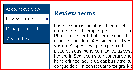
The following is the markup to produce the 4 tabs so they are exposed correctly to assistive technologies using the design pattern outlined above. In this example, the second tab, "Review Terms", is the currently selected tab.
The following keystrokes should be supported by the tab control.
Key | Description |
---|---|
TAB | The active tab in the tab list should initially receive focus. Pressing TAB again should move focus to the next focusable element outside of the tab list, which might be in the associated tab panel. |
LEFT ARROW | When focus is on a tab in the tab list, focus should move to the previous tab in the list. When the first tab in the list has focus and the LEFT ARROW is pressed, the last tab in the tab list should receive focus. |
RIGHT ARROW | When focus is on a tab in the tab list, focus should move to the next tab in the list. When the last tab in the list has focus and the RIGHT ARROW is pressed, the first tab in the tab list should receive focus. |
UP ARROW | When focus is on a tab in the tab list, focus should move to the previous tab in the list. When the first tab in the list has focus and the UP ARROW is pressed, the last tab in the tab list should receive focus. |
DOWN ARROW | When focus is on a tab in the tab list, focus should move to the next tab in the list. When the last tab in the list has focus and the DOWN ARROW is pressed, the first tab in the tab list should receive focus. |
To see an implementation of this design pattern, see Hans Hillen's accessible jQuery components demonstration that uses a tab control for each of the components.
There must be a way for assistive technology users to navigate from the tabs to the tab panels. Cursor keys are usually used as reading keys, but the cursor keys are being used to control the tabs so are no longer available for this purpose. This is where the aria-controls
attribute should help, as the relationship is defined, so there just needs to be a way for the user to navigate to the associated panel.
Firefox with JAWS does this by announcing, "Press JAWS key + ALT + M to move to controlled element". When those keys are pressed, JAWS announces, "Moved to controlled element". The user can then navigate the panel using regular keystrokes. Unfortunately, all other browser/assistive technology combinations I tried did not provide a mechanism to navigate to the controlled element. Chrome/JAWS consistently announces, "Failed to move to controlled element" when using JAWS key + ALT + M, so it could be they plan to implement something soon with JAWS.
There are obviously ways of navigating into the panel, but not acceptable equivalents of certainly knowing that you're at the top of the panel. For example, in JAWS, a user could toggle the virtual cursor on and off to break the cursor navigation with tabs and then navigate to the panel. Or the user could tab to the next focusable interface element (if there is one, which may or may not be in the tab panel), and then navigate backwards to try and find the tab. But these are clumsy recovery techniques that users will have to use if these kinds of widgets are deployed without user agent support. The only solution I can think of now is for developers to designate a keystroke that allows navigation to the panel, and ensure it's documented, until there is better support.
Most of us have come across scenarios where web accessibility testing with assistive technologies produces unexpected results, when we know the underlying structure of the web page is correct. Assistive technologies are complex, so it's not surprising they sometimes go wrong, but we need to know how to recover when they're being unresponsive or providing incorrect information. My colleague, Hans Hillen, sent an email internally at TPG about handling erratic behaviour with JAWS, and has kindly allowed me to post it here, as this is useful information.
What techniques do you use to handle strange behaviour in JAWS and other assistive technologies?
The following is the standard approach to dealing with JAWS Quirks (follow in order until the issue is fixed):
The virtual mode has stopped working when the keystrokes to navigate the virtual buffer have stopped working. For example, H for heading navigation doesn't work anymore. When requesting a virtual list (e.g. a link list), JAWS will announce, "this feature is only available in a virtual document". The website is essentially being navigated in forms/application mode, although JAWS seems to provide less information than usual. When pressing certain virtual navigation keys, JAWS will be quiet, but if you press tab it will announce the keys as if you had typed them into a document (e.g. "H H H"). When tabbing between elements, JAWS may just say "TAB" or it may announce the focused element. Using the arrow keys will scroll the page rather than navigate virtually.
Sometimes JAWS gets stuck on a particular element and it will keep announcing it, instead of the elements actually being focused. If you test with an accessibility inspection tool, such as aViewer or Inspect32, the browser does in fact expose the correct information for the focused element, but JAWS still announces something else.
When navigating a data table (Ctrl + Alt + Arrow Keys), JAWS will sometimes act like there are no cells in a row or column. When navigating to an adjacent cell, it will announce "beginning/end of row/column", as though the actual cells in the data table do not exist.
When navigating to tables, headings, lists, and so on, JAWS announces that there are no elements of this type on the page, even though there clearly are.
When using the INS + F3 shortcut for opening the Virtual HTML features list, JAWS will sometimes display the "JAWS virtual find" search dialog instead.
The intention of this article is to gather other recovery techniques for all assistive technologies. What techniques do you use to handle strange behaviour in JAWS and other assistive technologies?
Custom-built dialogs are common in web-based applications, but many are not accessible. Most of them are not announced to assistive technologies, and so screen reader users are not made aware that a dialog has been launched. Many are also not focused when they are launched, and so keyboard-only users are still focused on elements in the background, and might have to navigate through the content in order to reach the dialog.
The WAI-ARIA specification defines roles and attributes that help ensure dialogs are announced correctly to assistive technology users, and provides guidance on ensuring they are keyboard accessible.
WAI-ARIA provides the dialog and alertdialog roles to define dialogs. The dialog
role is used when the user is expected to provide data, and the alertdialog
role is used to announce the contents of a dialog to the user.
The container element for both dialog
and alertdialog
should use aria-labelledby to identify the element containing the accessible name for the dialog (usually, the heading). This is announced when the dialog first receives focus, along with the role of dialog so the user understands the context. The aria-label attribute may be used if there is no heading in the dialog, but all dialogs should contain a visible heading.
alertdialog
role
Authors should use the aria-describedby attribute to identify the message of an alertdialog
. When the dialog is displayed, focus should be placed on an active element within the dialog, such as an OK button.
Consider a simple dialog with a list of instructions for shutting down a system.
The container for the dialog should have a role of alertdialog
, with the aria-labelledby
attribute containing a value that matches the id
attribute value for the heading, and the aria-describedby
attribute containing a value that matches the id
attribute value for the description.
dialog
role
When a role of dialog
is used, some screen readers will automatically go in to application mode. This shouldn't be a problem, as the dialog role should be used for getting data from the user, and screen readers usually automatically go into forms mode when interacting with form controls. Consider a dialog for the user to signup to a newsletter. As with the alertdialog
example, focus should be placed on an active element within the dialog; in this case, the "Email" edit box.
The container for the dialog should have a role of dialog
, with the aria-labelledby
attribute containing a value that matches the id
attribute value for the heading.
If we add instructions to the newsletter signup dialog, a screen reader user wouldn't be able to use their reading keys to read the instructions, as the dialog is displayed in application mode. For this reason, instructions and cues should be programmatically associated using the aria-describedby attribute.
The following example includes instructions, which are programmatically associated to the "Email" edit box using aria-describedby
.
The email address now requires the aria-describedby
attribute containing a value that matches the id
attribute value for the description.
There shouldn't really be a scenario where a screen reader user would need to interact with content in a dialog
using reading keys, but if there is, the content that requires reading keys should be placed in a container with a role of document. For example, if the dialog contains a data table, then the data table should be in a container with a role of document
so that screen reader users can use their table reading keys to interact with the table.
A modal dialog is a dialog that retains focus until the dialog is closed or dismissed. It should not be possible for keyboard-only users to accidentally tab into the background content when either a modal or non-modal dialog is displayed. With a modal and non-modal dialog, the user should either explicitly dismiss the dialog (for example, selecting "Cancel" or pressing ESC) or close it by taking a positive action, such as selecting "OK" or "Submit". With a non-modal dialog, the user should also be able to use the F6 key to switch between the dialog and the main content.
There are several techniques for creating tables with static header rows, but very few of the examples I have come across are accessible or do not work cross-browser. This post looks at some of the current solutions, and outlines a method using WAI-ARIA to fix the accessibility issues of the more popular techniques.
Ideally, this problem should be solved using just CSS by specifying the height
, overflow
, and display
properties on the body of the table (tbody
). This works to an extent, but is difficult to get working cross-browser. Pure CSS Scrollable Table with Fixed Header is an old but good example of a CSS version that works in most browsers and screen readers, but doesn't render properly in IE9.
Most solutions use JavaScript, and typically duplicate the header of the table into a separate table. jQuery Plugin for Fixed Header Tables is a good example of this technique, but there are plenty of other examples that essentially do the same. This technique is popular, because it's easier to get to work cross-browser. The accessibility of this solution is not so good, as it results in a separate table just for the headers. Most of the solutions that attempt to remain accessible duplicate the headers in the scrolling table and hide them visually so they are still available to screen readers; but there is still a redundant table in the content containing just the headers.
As having two tables seems to be the most reliable in terms of portability, one solution would be to repair the technique so that it appears as a single table to assistive technologies. Consider a data table that determines calories burned depending on the weight and pace of a runner with the headers in a completely different table so that the main body can be set to scroll, as most approaches appear to use this or a variation on this technique.
The process to repair and merge the table with WAI-ARIA is outlined below:
caption
.The following is the resulting structure:
Alternatively, the structure could be defined with WAI-ARIA removing the HTML tables completely, as it's far easier to control the div
elements with CSS than the tables.
This solution works well using JAWS. Unfortunately, it does not work well with VoiceOver on an iPad iOS6 or on a Mac. VoiceOver recognises the table as a single table, but does not map the columnheader
or rowheader
roles as column and row headers properly. In iOS6 they're ignored, and on a Mac they're reported incorrectly (thanks to Steve Faulkner for testing these roles on a Mac with VoiceOver).
Further, the W3C validator currently reports an error for columnheader
and rowheader
roles contained in a row
, but a bug has been filed and it is expected that this issue will be resolved shortly.
The best solution would be to use CSS to scroll the main body while leaving the headers static, but there doesn't appear to be an accessible solution that works cross-browser. If anyone knows of a solution, please post in the comments. As the most popular technique to have static headers in a data table is to put the headers and the table content in two different tables, then this repair technique seems reasonable (or defining the structure with WAI-ARIA alone). It's a shame the WAI-ARIA columnheader
and rowheader
roles are not better supported in VoiceOver, but support is likely to improve.
The Paciello Group (TPG) is carrying out a mobile accessibility survey. The survey will be available until the end of the month. If you have not taken or shared the survey, please do soon, as your input is valuable and we do not want to miss it.
The survey is a simple 15 question survey that takes just a few moments to complete, and we're looking for input from people with disabilities or people using assistive technologies on a mobile device. The more information we can gather on usage patterns, the better accessibility practitioners will be able to help mobile developers deliver accessible experiences.
Tabulated findings will be made public when the survey is complete to help mobile authors and accessibility professionals better serve the mobile accessibility community.
I wrote about the W3C's Web Accessibility Initiative - Accessible Rich Internet Applications (WAI-ARIA)'s live region properties 6 years ago, but the WAI-ARIA specification has changed significantly in that time, and the details in that article are now outdated. The examples in the original article used XHTML namespaces, which are irrelevant now that WAI-ARIA is supported in HTML5.
The original out-of-date article now redirects to this entry, which provides more information on live regions and how to use them, along with roles that have implied live regions.
When developers first built rich internet applications using a combination of HTML, CSS, and JavaScript, people with disabilities were left behind because those applications failed to provide the semantics required to be understood by assistive technologies. Sadly, not much has changed over the years, but that doesn't need to be the case. WAI-ARIA is capable of providing sufficient semantics to ensure rich internet applications can be understood, and is now relatively well supported.
A significant issue that the WAI-ARIA specification addresses is where parts of the page are updated without informing assistive technology users, using live regions.
Live regions inform assistive technology users of updates in the document without the user losing focus from their current activity. For example, announcing changes in a table that is dynamically updated with stock information. Live regions can also be used to aid the understanding of complex widgets. For example, Hans Hillen uses a hidden live region to announce how many items are returned in his example of an auto-complete widget, along with instructions to use the cursor keys to navigate through the list, as support for autocomplete isn't that good without this context at the moment. The following properties are used to define a live region.
aria-live
propertyThe aria-live property indicates a section within the content that is live and the verbosity in which changes shall be announced. The following values may be used to determine the verbosity.
aria-live="off"
aria-live="polite"
aria-live="assertive"
assertive
should only be used when the update is important and the user should be informed immediately.
In the following example, text changes or additions to the unordered list, they will be announced to the user.
aria-atomic
property
The aria-atomic property is an optional property that can have the values true
or false
(default). When the region is updated, the atomic property is used to indicate if assistive technologies should present all or part of the changed region to the user, and is influenced by the aria-relevant property. If the aria-atomic
property is set to true
, assistive technologies should present the entire region as a whole depending on the aria-relevant
property; otherwise, the part of the region that changed might be announced on its own.
Sometimes, updates make sense on their own, such as a new line arriving in a chat application. Other times, changes in the content may not make sense without the context of other parts of the region. In these cases, aria-atomic="true"
should be set on the relevant container so the region is presented as a whole. In the following example, if a change is made anywhere in the div
element, the whole content is announced to the user.
aria-relevant
property
The aria-relevant property is an optional property used to indicate the type of update that should be announced within a region. The aria-relevant
property accepts a space separated list of the following property values:
aria-relevant="additions"
aria-relevant="removals"
aria-relevant="text"
aria-relevant="all"
additions
, removals
, text
) apply to this region
In the absence of an explicit aria-relevant
property, the default is to assume there are text changes and additions (aria-relevant="text additions"
). In the following example, only additions to the unordered list will be announced to the user.
aria-busy
property
The aria-busy property should be used when the region is busily being updated, and stops updates being announced before they are complete. Setting aria-busy="true"
on the region suppresses announcements until the attribute is removed, or the value changed to false
. Assistive technologies collate the changes, and announce them when the region is no longer busy. In the following example, nothing is announced while the list items for the unordered list are being gathered. When the developer set aria-busy="false"
or removes the aria-busy
attribute, the unordered list will be announced.
WAI-ARIA also defines some roles that have live regions.
alert
role
The alert role is used to provide important information immediately to the user. A role of alert
is an assertive live region, meaning the message will be delivered to the user immediately.
status
role
The status role is used to provide advisory information to the user that isn't important enough for an alert. A role of status
has an implicit aria-live
value of polite
, but this doesn't necessarily mean it will be announced to the user. Authors can use the aria-live
property on the region to override how it's usually handled by assistive technologies.
timer
role
The timer role marks a region that contains a counter that represents either elapsed or remaining time that are updated as time changes until the timer is paused or completes the time count. A role of timer
is a live region with an implied aria-live
value of off
.
marquee
role
The marquee role is used when non-essential information changes regularly. A role of marquee
is a live region with an implied aria-live
value of off
. If you use marquees, ensure you provide a simple provision to stop it scrolling and updating, as they can be distracting and annoying.
log
role
The log role is used for regions where new messages are added at the end of the log, and older messages may disappear from the log, such as a chat log or messages in an error console. A role of log
has an implicit aria-live
value of polite
. If a text area is used to send updates to the region with a role of log
, the aria-controls attribute should be used to define the relationship.
For further information about using WAI-ARIA's live regions, see the authoring practices guide for WAI-ARIA on managing dynamic changes.
Tables shouldn't be used for layout, as they can result in redundant information being announced as the user navigates through the document using a screen reader, such as "table with 3 columns and 4 rows column 1 row 2 ⋯". When nested tables are used, other redundant information is announced, such as "table nesting level 3 column 2 row 1 ⋯".
If tables are used for layout, then the WAI-ARIA presentation role can be used to remove the table semantics so the table information is no longer announced when the user navigates the page.
When controls are grouped in a fieldset
element with a legend
, the content of the legend element is announced by screen readers to provide context for the individual controls in the fieldset. This is particularly useful for controls like radio buttons where the group needs a label, as the individual labels for each radio button may not make sense on their own; for example, if the label is just "Yes" or "No". Unfortunately, if the form controls in the fieldset are in a layout table, then the legend is not announced as a label for the group in JAWS, even if the table has role="presentation"
.
Although using role="presentation"
stops redundant table information being announced to screen reader users, form controls within a fieldset
are not reliably announced by JAWS with the context of the legend
element to provide a label for the group. In the following example, when a JAWS user navigates through the radio buttons, they hear something like, "radio button not checked maybe 1 of 3", "radio button not checked yes 2 of 3", and "radio button not checked no 3 of 3" without the context of "Attending" (Firefox with JAWS provides the context when navigating forwards to a radio button in the group, but not when navigating backwards to a radio button in the group. IE with JAWS completely ignores the context provided by the legend element).
If the layout table isn't included, a JAWS user hears "Attending" as the context for the radio button in the group that receives focus. Continuing to navigate through the radio buttons in the group only announces the radio button information, as the context has already been provided.
When form controls are in a layout table within fieldset
/legend
elements, the context information is lost in JAWS, even when the table semantics are removed with role="presentation"
. The obvious solution is to remove the layout table, but sometimes this option is too costly and developers just want a solution that works. One solution is to use WAI-ARIA's aria-describedby attribute. To do this, add an id
attribute to the legend
element, and use aria-describedby
on the radio buttons that references the id
attribute set on the legend
element.
This technique works with JAWS, but requires using aria-describedby
for each element in the fieldset. This approach also has the undesirable effect of announcing the context after the radio button information, rather than before the radio button, as the user would be used to with regular elements within a fieldset
/legend
section. It also means that screen readers that do announce the group label provided by the legend element also announce the description afterwards, which is overly verbose.
User agent | Result |
---|---|
IE9 and IE10 with JAWS 13 | "Attending?" Announced after the radio button information is announced. |
IE9 and IE10 with NVDA | "Attending?" announced as the label for the group, and announced again as the long description after the radio button information is announced. |
Firefox 17 with JAWS 13 | Announced after the radio button information is announced. |
Firefox 17 with NVDA | "Attending?" announced as the label for the group, and announced again as the long description after the radio button information is announced. |
Ideally, we want a group label that is announced just once the first time the group is visited, so a more effective solution would be to use a role of group (or region if the section is significantly important) on the table element instead of the presentation
role, and use aria-labelledby to provide the name for the group. Steve Faulkner pointed out that child element roles are unaffected by a parent role of group
, so the table semantics are still present and need overriding with role="presentation"
. This should result in the same relationship as fieldset
/legend
without the layout table.
This arrangement works in Firefox, and ensures that the context is reliably provided before the radio button information just once when the group is visited forwards or backwards, in the same way as when the layout table isn't present with fieldset
/legend
. Unfortunately, it is completely ignored in IE with JAWS, and announced twice in browsers that do announce the legend
content as a label for the group.
User agent | Result |
---|---|
IE9 and IE10 with JAWS 13 | Group label not announced. |
IE9 and IE10 with NVDA | "Attending?" group label announced twice. |
Firefox 17 with JAWS 13 | Group label announced once. |
Firefox 17 with NVDA | "Attending?" group label announced twice. |
As this attempt used lots of role="presentation"
markup, I decided to wrap the table in a div
element and moved the role="group"
and aria-labelledby
markup to the containing div
element, and put the table role back to role="presentation"
. This arrangement didn't work either. After further discussion with Steve Faulkner, he pointed out that IE doesn't suppress the semantics of table cell elements when role="presentation"
is used on the table
element (it should do). I added role="presentation"
to each of the table cells, and it finally worked as expected.
User agent | Result |
---|---|
IE9 and IE10 with JAWS 13 | "Attending?" announced as the group label. |
IE9 and IE10 with NVDA | "Attending?" group label announced twice. |
Firefox 17 with JAWS 13 | "Attending?" announced as group label twice when navigating forwards, and one when navigating backwards in to the group. |
Firefox 17 with NVDA | "Attending?" group label announced twice. |
The table element should only be used for describing data tables, rather than using tables for layout purposes. If layout tables absolutely cannot be avoided, then using role="presentation"
is effective at ensuring that redundant table information isn't announced to screen reader users. However, this can't be relied on alone when form controls within fieldset
/legend
elements are in layout tables for JAWS users.
If it's impossible to avoid layout tables for the whole website, at least avoid using tables for layout within fieldset
/legend
elements. If this isn't possible, then the repair technique is to wrap the table in an element with role="group"
and an aria-labelledby
attribute that identifies the group label (the legend
), and the table
element and each table cell must be overridden with role="presentation"
.
The repair technique for ensuring that form controls in a layout table within fieldset
/legend
elements is probably more complicated than not using layout tables in the first place, and duplicates the group label for assistive technologies that correctly ignore layout tables with role="presentation"
. Sometimes, it's difficult to find a repair technique that works in all situations, but using the most semantically appropriate elements will always result in a more accessible experience.