Summary
The aria-controls attribute is important for composite widgets where one element controls another, such as navigation widgets (links, buttons, or tabs controlling another section), tree views, and similar relationships where one element controls another. The attribute defines the relationship so that assistive technology users can navigate to the content effected by the controlling element; for example, from a tab to the associated tab panel.
Considering the importance of being able to define these relatively simple relationships, the aria-controls attribute has surprisingly poor support. The only browser/assistive technology combination that I'm aware of that supports this relationship at the moment is Firefox/JAWS.
Author: Gez Lemon
Simple tab control design pattern
A simple tab control design pattern will illustrate this issue, and is fairly common in web applications.
As the tabs are a collection of links, they should initially be marked up in an unordered list, but the list roles should be overridden using WAI-ARIA roles and use properties to ensure they are understandable to assistive technologies. The unordered list (ul) containing the list of links should have a role of tablist. The list items themselves could be put in to the keyboard tab order with the correct roles, or the list items could contain regular anchor elements that have their roles changed to make them understandable to screen readers. If this approach is chosen, the role of the list items should be changed to presentation so the semantics of list items are not conveyed to assistive technologies. The rest of this discussion assumes an anchor element will be used within a list item, as that's the best approach for progressive enhancement and seems to be the most common design pattern deployed for tabs.
Each anchor element in the list should have a role of tab, and the following attributes should be set for each anchor element:
- aria-selected - indicates whether this tab is the currently selected tab in the tab list.
- aria-controls - identifies the id attribute value of the panel that is displayed when this tab is selected. This is the relationship that should allow assistive technologies to navigate to the panel.
- tabindex - A value of
0means that the element is included in the tab order where it is in the source, and a value of-1means that it is not included in the keyboard tab order, but can receive programmatic focus with JavaScript (objTab.focus();). Only the currently selected item in the tab should have a tabindex attribute value of 0, so the user can skip the group of links pressing TAB. Using the cursor keys should change the TAB selection (the keyboard keystrokes provided at the end of this section).
The panels that are controlled by the tabs in the tab list should have a role of tabpanel, and the following attributes should be set on each panel:
- aria-hidden - Indicates whether the element is visible or not.
- aria-expanded - Indicates whether the element is currently expanded or collapsed.
- aria-labelledby - Identifies the tab that labels this panel.
Consider the following example with 4 tabs.
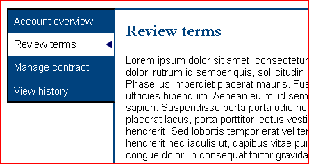
The following is the markup to produce the 4 tabs so they are exposed correctly to assistive technologies using the design pattern outlined above. In this example, the second tab, "Review Terms", is the currently selected tab.
<ul role="tablist">
  <li role="presentation">
    <a href="#"
       role="tab"
       aria-controls="panel1"
       aria-selected="false"
       tabindex="-1"
       id="tab1">Account overview</a>
  </li>
  <li role="presentation">
    <a href="#"
       role="tab"
       aria-controls="panel2"
       aria-selected="true"
       tabindex="0"
       id="tab2">Review terms</a>
  </li>
  <li role="presentation">
    <a href="#"
       role="tab"
       aria-controls="panel3"
       aria-selected="false"
       tabindex="-1"
       id="tab3">Manage contract</a>
  </li>
  <li role="presentation">
    <a href="#"
       role="tab"
       aria-controls="panel4"
       aria-selected="false"
       tabindex="-1"
       id="tab4">View history</a>
  </li>
</ul>

<div id="panel1"
     role="tabpanel"
     aria-hidden="true"
     aria-expanded="false"
     aria-labelledby="tab1">
  <h2>Account overview</h2>
  ⋯
</div>

<div id="panel2"
     role="tabpanel"
     aria-hidden="false"
     aria-expanded="true"
     aria-labelledby="tab2">
  <h2>Review terms</h2>
  ⋯
</div>

⋯

<div id="panel4"
     role="tabpanel"
     aria-hidden="true"
     aria-expanded="false"
     aria-labelledby="tab4">
  <h2>View history</h2>
  ⋯
</div>
The following keystrokes should be supported by the tab control.
| Key | Description |
|---|---|
| TAB | The active tab in the tab list should initially receive focus. Pressing TAB again should move focus to the next focusable element outside of the tab list, which might be in the associated tab panel. |
| LEFT ARROW | When focus is on a tab in the tab list, focus should move to the previous tab in the list. When the first tab in the list has focus and the LEFT ARROW is pressed, the last tab in the tab list should receive focus. |
| RIGHT ARROW | When focus is on a tab in the tab list, focus should move to the next tab in the list. When the last tab in the list has focus and the RIGHT ARROW is pressed, the first tab in the tab list should receive focus. |
| UP ARROW | When focus is on a tab in the tab list, focus should move to the previous tab in the list. When the first tab in the list has focus and the UP ARROW is pressed, the last tab in the tab list should receive focus. |
| DOWN ARROW | When focus is on a tab in the tab list, focus should move to the next tab in the list. When the last tab in the list has focus and the DOWN ARROW is pressed, the first tab in the tab list should receive focus. |
To see an implementation of this design pattern, see Hans Hillen's accessible jQuery components demonstration that uses a tab control for each of the components.
Usage issues
There must be a way for assistive technology users to navigate from the tabs to the tab panels. Cursor keys are usually used as reading keys, but the cursor keys are being used to control the tabs so are no longer available for this purpose. This is where the aria-controls attribute should help, as the relationship is defined, so there just needs to be a way for the user to navigate to the associated panel.
Firefox with JAWS does this by announcing, "Press JAWS key + ALT + M to move to controlled element". When those keys are pressed, JAWS announces, "Moved to controlled element". The user can then navigate the panel using regular keystrokes. Unfortunately, all other browser/assistive technology combinations I tried did not provide a mechanism to navigate to the controlled element. Chrome/JAWS consistently announces, "Failed to move to controlled element" when using JAWS key + ALT + M, so it could be they plan to implement something soon with JAWS.
There are obviously ways of navigating into the panel, but not acceptable equivalents of certainly knowing that you're at the top of the panel. For example, in JAWS, a user could toggle the virtual cursor on and off to break the cursor navigation with tabs and then navigate to the panel. Or the user could tab to the next focusable interface element (if there is one, which may or may not be in the tab panel), and then navigate backwards to try and find the tab. But these are clumsy recovery techniques that users will have to use if these kinds of widgets are deployed without user agent support. The only solution I can think of now is for developers to designate a keystroke that allows navigation to the panel, and ensure it's documented, until there is better support.
Category: Accessibility.
[aria-controls-lack-support.php#comment1]
Nice article & good to know I'm using the correct ARIA attr's for my tabs, I just need to improve keyboard support.
Just wondering why not include the ID value of the tab panel for its relevant tab link? If using just '#' for the links href attr then semantically it's no longer a link but a button e.g. <button>.
Posted by Chris on
[aria-controls-lack-support.php#comment2]
Hi Chris,
Yes, good point. The id attribute value for the corresponding tab panel would be a more appropriate href value, particularly for progressive enhancement.
Posted by Gez on
[aria-controls-lack-support.php#comment3]
What you wannt is normalization with respect to usability and expected behaviour
among different AT tools.
Normalization in this business comes by acceptance of features by users and plugs by other players when it it found to be beneficial.
This takes time but will come one day.
What is much more evident, is that until today HTML5 does not support a tabstrip-like concept for a respective element, neither do UA's, so different ARIA-based implementations have to fill the gap and this is the real shame (oh yes, I forgot, documents have no tab strips).
Here the real pressure has to be put. Come and wave the flag with me.
Posted by Steve on
[aria-controls-lack-support.php#comment4]
Hi,
A very nice article on ARIA.
Thank you!
Posted by Vivien on
[aria-controls-lack-support.php#comment5]
Does aria-controls affect the behavior of any of the screen readers? Or can the screen reader user navigate to what it points to?
When the item is expanded, should the author make it next in the tab order so that users can navigate to it with a tab key when it’s expanded? Perhaps from there the user would navigate with more tab keys or arrow keys depending on what it is.
Finally, I think some screen readers may automatically try to read live changes on a page when a user’s click or key press caused the change. Firefox has an object attribute to tell the AT when this has happened. I’m not sure if anyone has implemented that. If they have, it might be important to put aria-live=”off” on the expanding region.
Posted by green campus on
[aria-controls-lack-support.php#comment6]
Only JAWS with Firefox supports aria-controls at the moment. If the user presses JAWS key + ALT + M, focus moves to the panel.
It shouldn't be necessary to put the whole tab panel in the keyboard tab order. Essentially, all that's required is a way of stopping screen reader keystrokes being absorbed by the tabs, as the keys they use to cycle through the tabs are the same keys they would use for virtual navigation. The JAWS/Firefox implementation is a good method of stopping interaction and moving to the controlled element.
Posted by Gez Lemon on
[aria-controls-lack-support.php#comment7]
I have been trying to get a drop-down style on my site and I know there are JQuery according style menus but I just use the "#" sign in the custom link address of a custom menu. Then I add the pages as sub-items to give the site links on the secondary bar a drop-down style menu. Is is okay to use this method? My site is built with Studio Press on top of WordPress...
Posted by HJI on
[aria-controls-lack-support.php#comment8]
Nice article & good to know I'm using the correct ARIA attr's for my tabs, I just need to improve keyboard support.
Just wondering why not include the ID value of the tab panel for its relevant tab link? If using just '#' for the links href attr then semantically it's no longer a link but a button e.g. <button>.
Posted by Will J Thomas on